Friday, 27 March 2015

Thursday, 26 March 2015
Evaluation Questions
These are the four Evaluation Questions that I will be answering for my three products:
1) In what
ways does your media product use, develop or challenge forms and conventions of
real media products?
2) How
effective is the combination of your main product and ancillary texts?
3) What have
you learned from your audience feedback?
4) How did
you use media technologies in the construction and research, planning and
evaluation stages?
Tuesday, 24 March 2015
17th Edit of Music Video
This is the 16th Edit of my music video. I have added a lot more compared to my 14th Edit and I am almost finished the whole thing. The deadline for the Music Video is the 17th March and I believe that this is a very realistic target.
Thursday, 19 March 2015
Final Ancillary Text 1
This is the final draft of my second ancillary text:

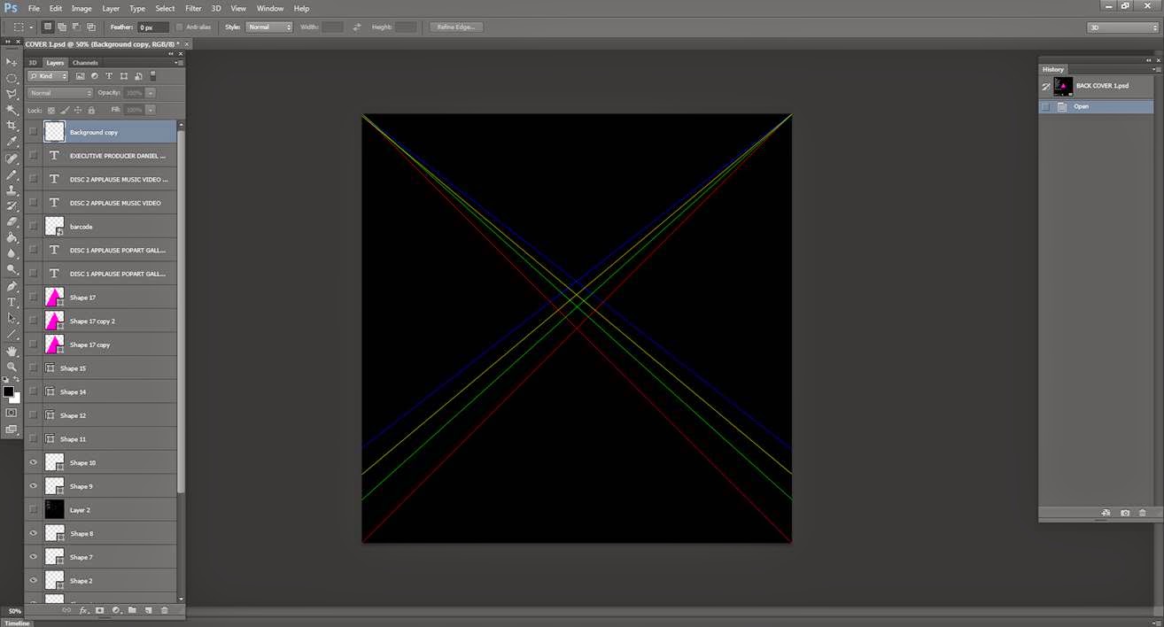 I started by having a blank black canvas. I then researched into famous covers of albums and the one that stood out was the Pink Floyd front cover to one of their albums. This featured a black canvas with streams of light refracting through a prism. I then developed this idea and added the beams of light, but this time in different directions, different to the Pink Floyd album.


I am very pleased with the overall look of my digipak. I feel like I have kept with the theme of art, which has been apparent in my three products.
Creating the back cover:
The next stage I took was adding the triangle/prism to the cover. The cover prism was translucent so I changes this and instead used the same shade of pink I used for the Andy Warhol style front cover. This didn't seem enough to be going on so after this I then added two more triangles next to the original but this time changed their opacity to around 50%, thus creating the illusion the top triangle was infront of the ones next to it. It also created a 3D effect.
After I had added the two other triangles I the added two conventions of a back cover. The production information and the barcode. The production information tells the audience who produced/wrote/mixed and distributed the. I looked at one from a similar genre album, 'Born This Way' by Lady Gaga and just changed the names where appropriate. I also then added some more lines by using the shape tool to 'fill' out the canvas a lot more because I felt that it was rather thin.
The next convention of the back cover I added was the repertoire. The repertoire is basically just a track list for the album. The songs I included in the album are a mixture of made up titles and real songs. The made up titles are thought of from the basis of art, songs such as 'Piet Mondrian' and 'It's Not Art' show that I have really thought about this, and there is continuity throughout based on the theme of art.
After I had finished the previous section I still wasn't satisfied with the overall look of the back cover. So I decided to use a technique I used for magazine front cover, layering, but this time not changing the RGB, only changing the opacity. I first copied the layer of text that I wanted to layer, I then pasted it on top of the existing layer and changed the opacity to around 56%. I then moved it two placs down and four places to the left, this gave it a 3D effect.
This is my final back cover:
I am very pleased with the outcome of the back cover. I started off with no ideas, but ater researching, the Pink Floyd album really came as an inspiration. The colour scheme fits with the rest of my product and my other products as well.
Wednesday, 18 March 2015
Final Ancillary Text 2
This is my final draft for my second Ancillary text, the magazine advertisment:
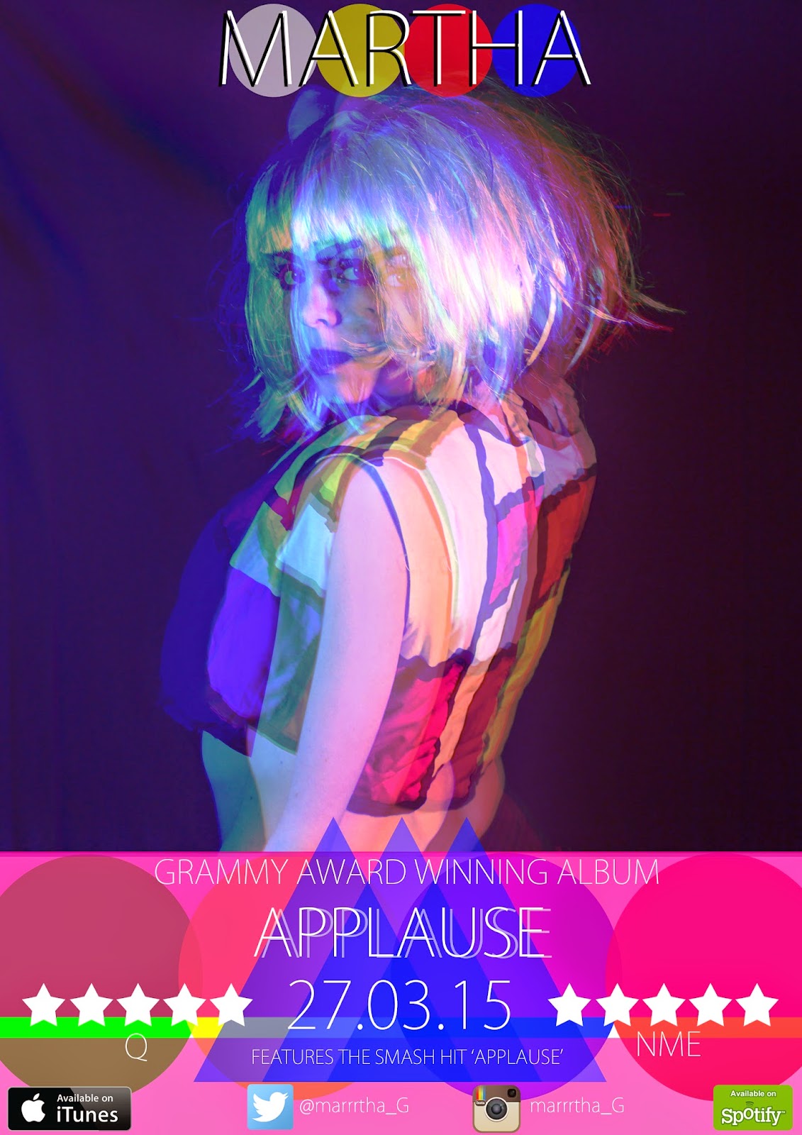
I am very pleased at how my Ancillary text has turned out. I especially like my use of shapes and colours that compliment each other and also compliment the style of my digipak.
The use of the shadowing effect was something that I thought really stood out when creating my digipak so i decided that it would be the main effect on the music magazine. I feel like I have come a long way in using different techniques on photoshop since I first started last year. Instead of using the magic wan tool to get rid of the background, i now take the photos on the background that I feel suits the style of my product the most and then use different tools from there such as the colour balance tool. This alows me to change the colour of the whole picture, mainly blues, greens and reds were used when creating this magaze advertisment. I then changed the opacity of the picture and layered the different pictures on top to create my desired effect.
Creating a Twitter Account for my artist
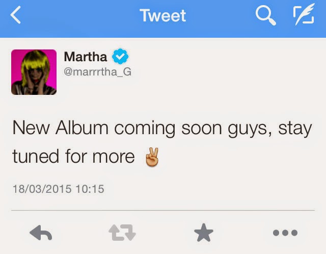
I have decided to create a Twitter account for my artist sharing the same name address as the name on the magazine advertisment. I have also photoshopped a verified twitter sign next to the name on her account as this shows that she is a know artist.
As part of the promotion of the album I will keep posting and keeping the fans up to date with the progression of the release. This includes sneak peaks of the music video, album cover and showing the followers the magazine advertisment. Here are some of the Tweets so far:
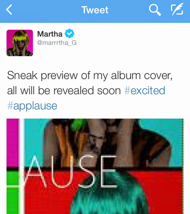
As part of the promotion of the album I will keep posting and keeping the fans up to date with the progression of the release. This includes sneak peaks of the music video, album cover and showing the followers the magazine advertisment. Here are some of the Tweets so far:
Subscribe to:
Posts (Atom)