I am very pleased with the overall look of my digipak. I feel like I have kept with the theme of art, which has been apparent in my three products.
Creating the back cover:
The next stage I took was adding the triangle/prism to the cover. The cover prism was translucent so I changes this and instead used the same shade of pink I used for the Andy Warhol style front cover. This didn't seem enough to be going on so after this I then added two more triangles next to the original but this time changed their opacity to around 50%, thus creating the illusion the top triangle was infront of the ones next to it. It also created a 3D effect.
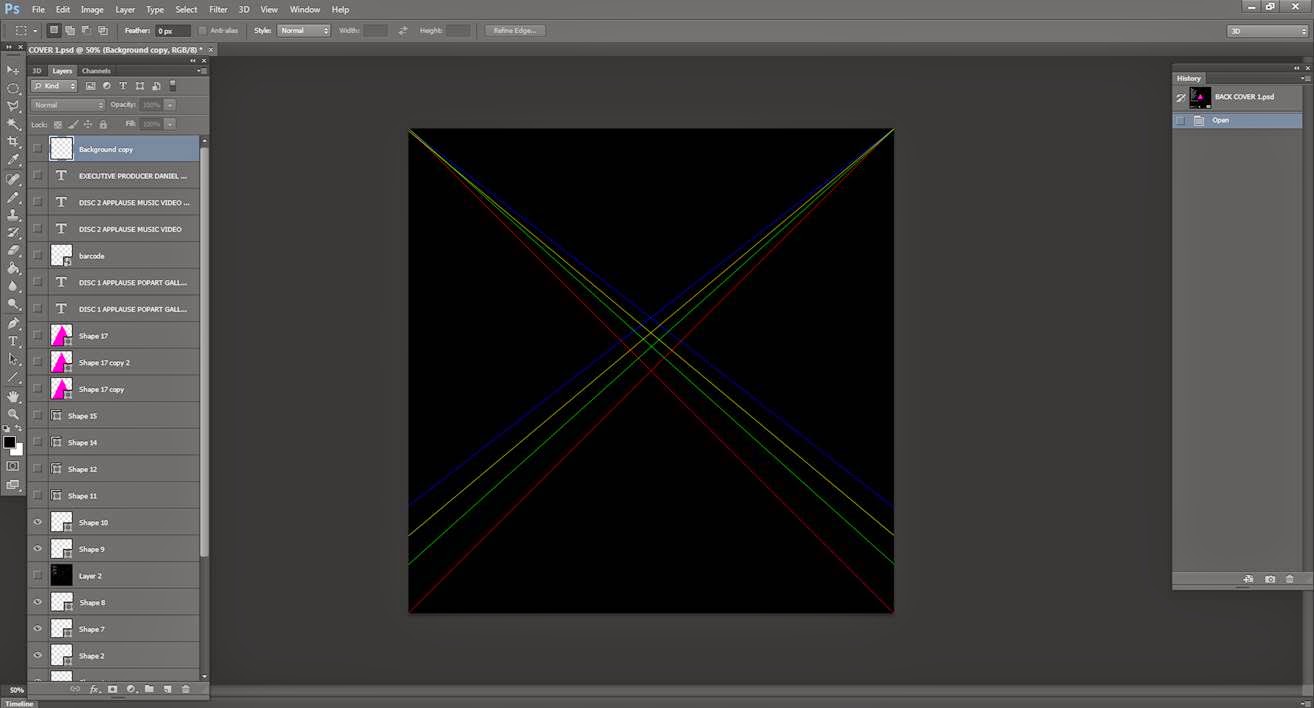
After I had added the two other triangles I the added two conventions of a back cover. The production information and the barcode. The production information tells the audience who produced/wrote/mixed and distributed the. I looked at one from a similar genre album, 'Born This Way' by Lady Gaga and just changed the names where appropriate. I also then added some more lines by using the shape tool to 'fill' out the canvas a lot more because I felt that it was rather thin.
The next convention of the back cover I added was the repertoire. The repertoire is basically just a track list for the album. The songs I included in the album are a mixture of made up titles and real songs. The made up titles are thought of from the basis of art, songs such as 'Piet Mondrian' and 'It's Not Art' show that I have really thought about this, and there is continuity throughout based on the theme of art.
After I had finished the previous section I still wasn't satisfied with the overall look of the back cover. So I decided to use a technique I used for magazine front cover, layering, but this time not changing the RGB, only changing the opacity. I first copied the layer of text that I wanted to layer, I then pasted it on top of the existing layer and changed the opacity to around 56%. I then moved it two placs down and four places to the left, this gave it a 3D effect.
This is my final back cover:
I am very pleased with the outcome of the back cover. I started off with no ideas, but ater researching, the Pink Floyd album really came as an inspiration. The colour scheme fits with the rest of my product and my other products as well.


No comments:
Post a Comment