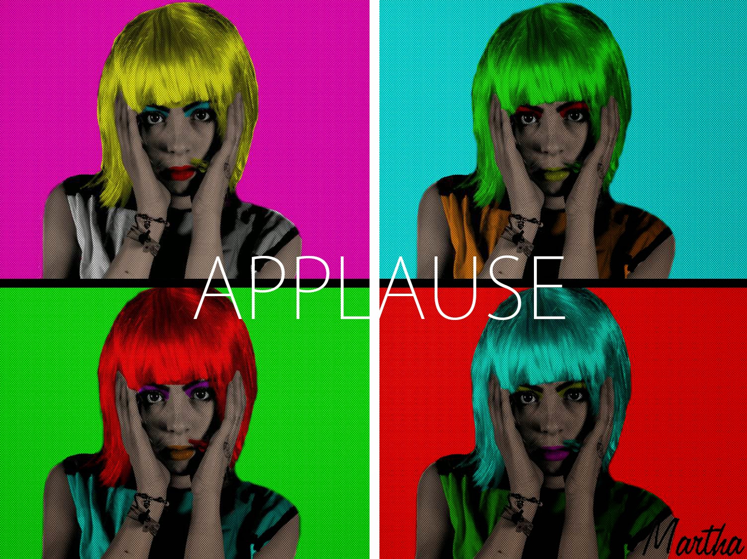
I then had to come up with ideas that I could use to create my front cover. Now for this I had already been looking into images that related to the style of music. This was electropop, there wasn't a lot of helpful information on this so I then decided to look further and look at the original artist of the song, Lady Gaga. The song itself is from the album Artpop, which inspired me to look into the orgins of popart and modern art. Modern art was a major inspiration for the music video so it would seem very appropriate to carry the theme on.
As seen in previous posts I was dead certain on using Andy Warhol's silkscreen popart images as inspiration for the front cover. I really liked this so I searched YouTube for tutorial videos on how to manipulate images to look like a popart image.
This was the progress of my front cover:
I started off by choosing the image, i narrowed it down to these three:
The image that I then chose was the middle image. I chose this because you can clearly see the front of the face and it is also in direct mode of address. This would make it more engaging for the audience and also easier for me to create the pop art image.
So, after I chose the image, I opened it up in Photoshop and the first thing I need to do was desaturate the image to make it black and white. The black and white image makes it easier to colour the facial features in later on in the process. After the desaturation of the image I created a quick mask around the model, a quick mask is a simpler way of separating the feature from the background.
After the quick mask I then deleted the background and added the dots to the image by going into FILTER and then FILTER GALLERY.
After this came the colouring of the whole image:
The whole of the colour surrounded the image and to the get the desired effect I used the pencil tool and colouring the skin using the colour f7ceb7, which is basically white skin colour.
I then coloured in the rest of the features:
This process to get everything absolutely right took me a couple of days but this is the finished basic idea for my front cover:
I am very pleased with how this looks as I feel it is very similar to the Andy Warhol images. The next step was to the create a full album.
This is the process I took in creating the front cover (the rest of it):
The first draft of the front cover, just the album title Applause is added on the front. The next step I took was changing the font and adding an artist name.
The artists name, I felt, had to be like a signature on an artist's piece of work. This sticks with the theme of art throughout the digipak. There are multiple methods available to get the signature, such as collecting a siganture off the performer that I used and scanning that into the computer and editing it. But this was going to prove rather time consuming, so I decided to use a free siganture builder website, this allowed me to create the siganture in minutes. The other decision I had to make was, do I use the performers full name, Martha Godber. Or do I use the just her first name. i decided to just use her first name, as this has proven very successful in artists such as Madonna, Cher and Cheryl. This was the finished product:
The next step was fine tuning how the front cover should look. After a few audience feedbacks the main problem was that the four colours just looked like blocks. So it was suggested to me that I add lines between them to make them appear more seperated. This was the outcome and the final product:

As you can see other than add the signature I have aded the lines between the boxes and the audience feedback proved very successful as I do believe it makes it look better. I am happy with how it has turned out and I have improved a lot on since the first rough draft with the image off the interent.


No comments:
Post a Comment