Sunday 19 April 2015

Final Products

Music Video:

Ancillary Text 1 - Digipak
Ancillary Text 2 - Magazine Advertisement

Question 1 - In what ways does your media product use, develop or challenge forms and conventions of real media products?


Question 2 - How effective is the combination of your main product and ancillary texts?


Question 3 - What have you learned from your audience feedback?


Audience Feeback - Focus Group Watching t
The reason I filmed the focus group watching the music video because I wanted to gather phsical/facial reactions rather than verbal responses. This wasnt as effective as I would have thought it would have been because there wasn't anything major in the video that provoked a response, or was set up to provoke a response. A postitive I can take from this is that the focus group were indeed focused, they were engaged to the music video throughout and this shows that I have created a product that is attractive for the audience.
Response To the Music Video: Audience Response: This is the audience response after watching the music video. There were some very posituve answeres that I gathered and also some constructive critisism on what I can improve on. They all rated my video 10/10 which is a very positve sign that I have created a exciting product. But what I would have done differently was ask them what they though the theme of the video was rather than ask them if they understood that the theme of the video was art. After the constructive critisism I then went back to the video and explored how I could make some of the shots brighter, and trying to not be repetative. There was also some feedback that I didn't include on the PowToon that asked me to make some of the edits more on the beat, and I completely agreed with this. One of the grading criteria is editing to the beat. I then went back from my 22nd edit and made some of the lettering such as 'A P P L A U S E' a lot more in time and also there was one section where the drum beat gets faster and I had text flashing differnt colours to this beat. I changed the lenght of the clips and now I believe that it is now in time.

Thursday 26 March 2015

Evaluation Questions

These are the four Evaluation Questions that I will be answering for my three products:
1) In what ways does your media product use, develop or challenge forms and conventions of real media products?

2) How effective is the combination of your main product and ancillary texts?

3) What have you learned from your audience feedback?


4) How did you use media technologies in the construction and research, planning and evaluation stages?

Tuesday 24 March 2015

17th Edit of Music Video

This is the 16th Edit of my music video. I have added a lot more compared to my 14th Edit and I am almost finished the whole thing. The deadline for the Music Video is the 17th March and I believe that this is a very realistic target.

Thursday 19 March 2015

14th Edit of My Music Video

This is the 14th edit of my music video:

Final Ancillary Text 1

This is the final draft of my second ancillary text:
I am very pleased with the overall look of my digipak. I feel like I have kept with the theme of art, which has been apparent in my three products.
Creating the back cover:
 
I started by having a blank black canvas. I then researched into famous covers of albums and the one that stood out was the Pink Floyd front cover to one of their albums. This featured a black canvas with streams of light refracting through a prism. I then developed this idea and added the beams of light, but this time in different directions, different to the Pink Floyd album.
The next stage I took was adding the triangle/prism to the cover. The cover prism was translucent so I changes this and instead used the same shade of pink I used for the Andy Warhol style front cover. This didn't seem enough to be going on so after this I then added two more triangles next to the original but this time changed their opacity to around 50%, thus creating the illusion the top triangle was infront of the ones next to it. It also created a 3D effect.
 
After I had added the two other triangles I the added two conventions of a back cover. The production information and the barcode. The production information tells the audience who produced/wrote/mixed and distributed the. I looked at one from a similar genre album, 'Born This Way' by Lady Gaga and just changed the names where appropriate. I also then added some more lines by using the shape tool to 'fill' out the canvas a lot more because I felt that it was rather thin.
 
The next convention of the back cover I added was the repertoire. The repertoire is basically just a track list for the album. The songs I included in the album are a mixture of made up titles and real songs. The made up titles are thought of from the basis of art, songs such as 'Piet Mondrian' and 'It's Not Art' show that I have really thought about this, and there is continuity throughout based on the theme of art.

After I had finished the previous section I still wasn't satisfied with the overall look of the back cover. So I decided to use a technique I used for magazine front cover, layering, but this time not changing the RGB, only changing the opacity. I first copied the layer of text that I wanted to layer, I then pasted it on top of the existing layer and changed the opacity to around 56%. I then moved it two placs down and four places to the left, this gave it a 3D effect.
This is my final back cover:
 
I am very pleased with the outcome of the back cover. I started off with no ideas, but ater researching, the Pink Floyd album really came as an inspiration. The colour scheme fits with the rest of my product and my other products as well.


Wednesday 18 March 2015

Final Ancillary Text 2

This is my final draft for my second Ancillary text, the magazine advertisment:

I am very pleased at how my Ancillary text has turned out. I especially like my use of shapes and colours that compliment each other and also compliment the style of my digipak.
The use of the shadowing effect was something that I thought really stood out when creating my digipak so i decided that it would be the main effect on the music magazine. I feel like I have come a long way in using different techniques on photoshop since I first started last year. Instead of using the magic wan tool to get rid of the background, i now take the photos on the background that I feel suits the style of my product the most and then use different tools from there such as the colour balance tool. This alows me to change the colour of the whole picture, mainly blues, greens and reds were used when creating this magaze advertisment. I then changed the opacity of the picture and layered the different pictures on top to create my desired effect.

Creating a Twitter Account for my artist

I have decided to create a Twitter account for my artist sharing the same name address as the name on the magazine advertisment. I have also photoshopped a verified twitter sign next to the name on her account as this shows that she is a know artist.
As part of the promotion of the album I will keep posting and keeping the fans up to date with the progression of the release. This includes sneak peaks of the music video, album cover and showing the followers the magazine advertisment. Here are some of the Tweets so far:


Tuesday 17 March 2015

Audience Feedback on Magazine Advertisement

 
What do you like about the poster?
  • The use of bold colour and geometric shapes which compliment the costume that Martha is wearing looks good as it makes a statement.
  • The poster is very eye-catching due to the choice of colours and special effect. I also like the use of minimal text as it makes it more appealing to look at. The design is that complex, that it's made to look simple which is also effective.
What can I improve?
  •  Make the 'Martha's Applause' more Predominant
  • Prehaps the 'Marths's Applause' may be hard to read for some people due to the double overlay.
What can you say about the colours used?
  •  The combination of primary and secondary colours compliment each other well and imediatly draw yourself to the poster - benefitial to the magazine.
  • I really like the choice of colours used as they are used in the Piet Mondrian pattern in the artist's top.
What can you say about the look/style of the advertisement?
  • The style of the poster is very retro and the use of layering is very effective
  • A simplistic use of geometric shapes and lines collaborate with the costume of Martha's. the lack of detail in the background help to centralise Martha and make her the focal point.
Would you buy the album after seeing this magazine advertisement?
  • I would deffo buy the album after seeing this
  • I would buy the album


Magazine Advertisment

First Draft


Second and Final Draft:


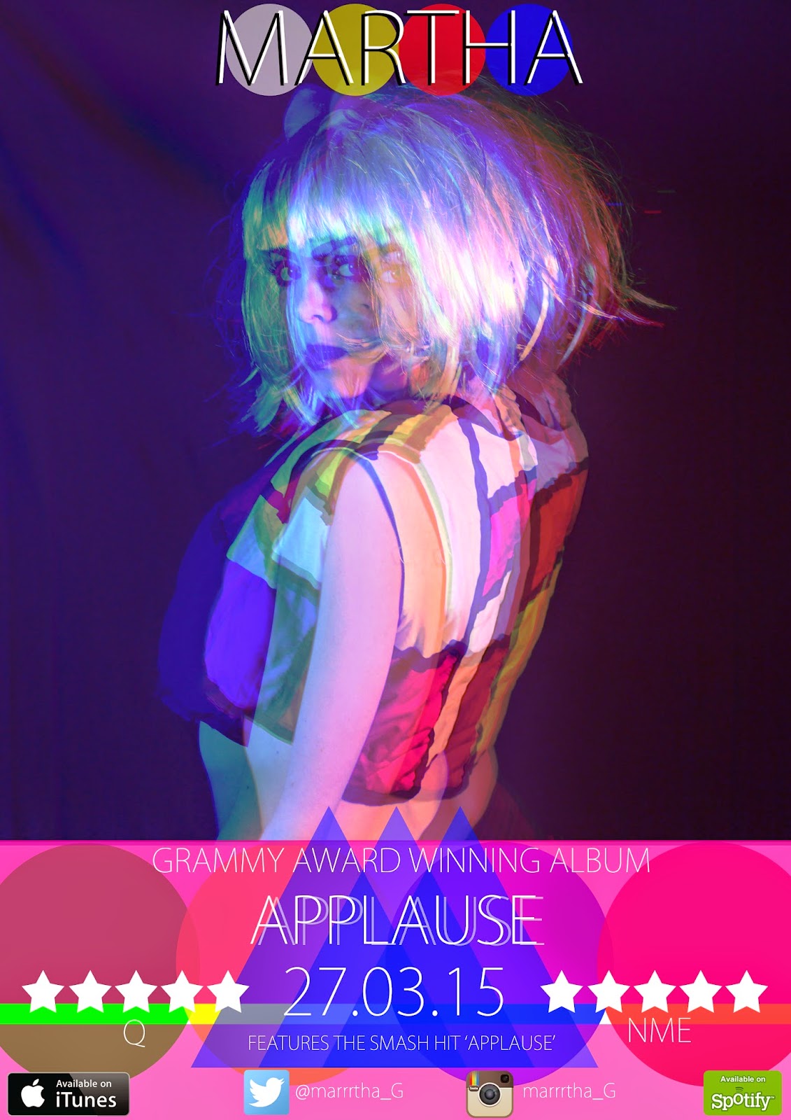
As you can see I have made some changes since the first draft, for example I have added the word album onto the 'GRAMMY AWARD WINNING'. This is just to show the audience that it is indeed an album and not promoting a single.
The next thing I have changes is the name of the artist at the top. This makes it more prominant to the audience and also shadowing it with a black shadow instead of a more transparent white one also makes it stand out.
Addding this at the top then made room for the album name to stand out more on it's own rather than the first one looking like the title 'MARTHA'S APPLAUSE' was the name of the album.
I have also added a plug line underneath the date, this again promots the album to the target audience as it is telling them that the album includes the 'SMASH HIT APPLAUSE'.


Creating the advertisment:

I started off by narrowing it down to just three images that I felt best supported the format of a music magazine advertisment. These are the three images I chose:


As you can see the image that I chose was the first one. I then changed the colour balance of the image to mainly red added it to an A4 sheet, resized it and this was the result:


I did the same for the blue and the green layers, this then gave me the layered 3d effect:
This effect also made the image similar to the original colours. I did like this effect when I was constructing my digipak so I decided that it would be very eye-catching on the magazine advertisement.


Now I was left with the space at the bottom and was wondering what I could do to fill the space, I didn't really want to copy off any existing advertisements, I wanted it to look fresh and new, something that did suit the style of the music video and the digipak. This was art.
I looked at my digipak for inspiration and was influenced by the use of the geometric shapes; so I filled the space with circles:

Again I changed the opacity of the shapes so they would overlay each other and create a sort of venn diagram effect. But this wasn't enough and to me it didn't stand out enough so again I put in some more geometric shapes, this time two rectangles and changed the opacity so you can see the circles. Again this was inspired by my digipak:


I left the space in between the the rectangles so you can see the colours of the circles. These colours match the block colours used by Piet Mondrian in his products. I then added the writing to the image. This is conventional of a music magazine advertisement. It shows the title of the album, reviews from other businesses in the music industry. For mine I used Q and NME. I used these because, from looking at music magazines last year these two magazines seemed most likely to showcase this type of music.
This is the advertisement with the conventional writing and reviews attached:


Again this didn't seem like there was a lot going on in the poster. So I decided to conduct some further research into the codes and conventions and I found out that almost all of the advertisements showed where the music was available. Again using research from the AS year, the music industry is very digitalised and is streamed. iTunes and Spotify are the worlds leading digital music streamers/sellers. So I added the 'Available on iTunes' and 'Available on Spotify logos'. Along with this research I found that the artists are on social media. Twitter and Instagram seemed the most appropriate to use for this artist, I feel that although Facebook is still one of the worlds leading social networking sites, it is slowly becoming outdated with Twitter being more 'up-to date'. This was when I came up with the idea of actually creating live Twitter and Instagram accounts:


This was going to be my final product but with initial feedback from a couple of friends and on reviewing it myself there still needed to be space filled at the bottom so you can see the writing properly.
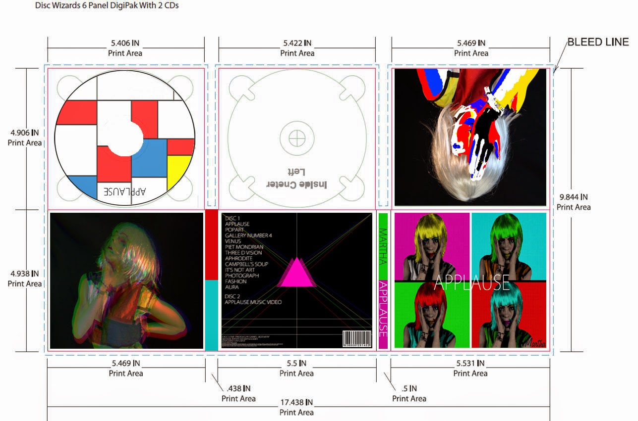
For my digipak I was influenced by an album cover by Pink Floyd, this was with the triangle and the beams of coloured light coming from the triangle. So in sticking with the style of my digipak I added a solid triangle and two translucent triangles of the same colour next to it, this was the result:


This was my first initial draft:
I again asked for feedback from the teacher and she suggested that I added something to the top. And I decided to put the Artists name at the top:


This didn't stand out as well as I hoped. So yet again, sticking to the theme of my ancillary text I added circles behind the 'MARTHA' at the top. This is my final product:


Friday 13 March 2015

Digipak So Far

This is my Digipak so far:
 
As you can see there are  three areas that I need to work on, the second spine and the two spaces for the discs. This I will do with a template from the internet. Overall I am pleased with how the album looks so far and I feel like I am achieving the look I was going for, which was artistic. This is shown with various forms of the art such as the Andy Warhol style popart, the painting over the skin, which represents the paintings and art of Piet Mondrian and the manipualtion of photographs and shapes on Photoshop that has allowed me to create a 3D looking image.
To move on from this I am starting to create the magazine advertisment.

With added CD:


Front Cover Progression

To Start my digipak I had to find a template that suited the 6 sided and two discs. This was shown to us by the media teachers and put on the college moodle. This is the template that I used:


I then had to come up with ideas that I could use to create my front cover. Now for this I had already been looking into images that related to the style of music. This was electropop, there wasn't a lot of helpful information on this so I then decided to look further and look at the original artist of the song, Lady Gaga. The song itself is from the album Artpop, which inspired me to look into the orgins of popart and modern art. Modern art was a major inspiration for the music video so it would seem very appropriate to carry the theme on.
As seen in previous posts I was dead certain on using Andy Warhol's silkscreen popart images as inspiration for the front cover. I really liked this so I searched YouTube for tutorial videos on how to manipulate images to look like a popart image.
This was the progress of my front cover:
I started off by choosing the image, i narrowed it down to these three:


The image that I then chose was the middle image. I chose this because you can clearly see the front of the face and it is also in direct mode of address. This would make it more engaging for the audience and also easier for me to create the pop art image.


So, after I chose the image, I opened it up in Photoshop and the first thing I need to do was desaturate the image to make it black and white. The black and white image makes it easier to colour the facial features in later on in the process. After the desaturation of the image I created a quick mask around the model, a quick mask is a simpler way of separating the feature from the background. 
After the quick mask I then deleted the background and added the dots to the image by going into FILTER and then FILTER GALLERY. 
After this came the colouring of the whole image:
The whole of the colour surrounded the image and to the get the desired effect I used the pencil tool and colouring the skin using the colour f7ceb7, which is basically white skin colour. 
I then coloured in the rest of the features:


This process to get everything absolutely right took me a couple of days but this is the finished basic idea for my front cover:
 I am very pleased with how this looks as I feel it is very similar to the Andy Warhol images. The next step was to the create a full album. 


This is the process I took in creating the front cover (the rest of it):

The first draft of the front cover, just the album title Applause is added on the front. The next step I took was changing the font and adding an artist name.


The artists name, I felt, had to be like a signature on an artist's piece of work. This sticks with the theme of art throughout the digipak. There are multiple methods available to get the signature, such as collecting a siganture off the performer that I used and scanning that into the computer and editing it. But this was going to prove rather time consuming, so I decided to use a free siganture builder website, this allowed me to create the siganture in minutes. The other decision I had to make was, do I use the performers full name, Martha Godber. Or do I use the just her first name. i decided to just use her first name, as this has proven very successful in artists such as Madonna, Cher and Cheryl. This was the finished product:
The next step was fine tuning how the front cover should look. After a few audience feedbacks the main problem was that the four colours just looked like blocks. So it was suggested to me that I add lines between them to make them appear more seperated. This was the outcome and the final product:


As you can see other than add the signature I have aded the lines between the boxes and the audience feedback proved very successful as I do believe it makes it look better. I am happy with how it has turned out and I have improved a lot on since the first rough draft with the image off the interent.
 

Thursday 5 March 2015

Filming in Ferens Art Gallery


I was granted permission by the staff at Ferens Art Gallery in Hull to film for the beginning section of my music video. This section was to be like the opening of the Katy Perry Video for 'This is How We Do'.
I feel like the filming today was very successful and I couldn't of asked for better help from my friend Katie who kindly agreed to be the actress. This has allowed me to almost complete filming for the music video. All that is left to do is film another section in the green room. I have booked the space out to use this facility tomorrow (Friday 6th March). Hopefully this will be the final filming section and for the next three weeks I can sorely focus on editing.

Gallery 3 of the exhibit was used:


Katie:


Tuesday 17 February 2015

Sixth Edit and sharing on social media

This is my sixth edit of my music video. I have added a new affect to the beginning of the video, were it says 'APPLAUSE' across the screen. This effect was edited in using the programme Adobe After Effects. I had never used the programme before so I felt like I was very lost when trying to figure out how to use the features and tools. But I then used a YouTube tutorial on how to use the liquefy tool. This then allowed my to complety the 'dripping' effect, but then the problem was making the word drip over a period of seconds on its own, this was then easily sorted out using the stopwatch tool in the liquefy section. All I did then was save the composition and add to the project.
Here is the finished dripping effect:

I have also changed the time that the performer turns her head around on 'I stand here waiting.....'. She now turns her head around on the beat and I feel that this gives a more powerfull feel to the start of the new section.
Sharing on Social Media
Twitter:
This is the share on Twitter, hopefully some of my 209 followers will take the time to feedback on what I have done so far and how I an improve some of the images/editing.

Friday 13 February 2015

Fourth and Fifth edit of my music video

These are the fourth and fifth edits of my music video. Although it doesn't look like I have changed the video all that much, I have been working significantly hard on improving the beginning section specifically on the 'APPLAUSE' section.

FOURTH EDIT:


FIFTH EDIT:

Thursday 12 February 2015

Sharing the edits on Social Networks


Twitter:
I have shared the video on Twitter and hopefully some of my followers will take a minute to feedback on my second edit.
Facebook:
Hopefully I will get the feedback that I want to enable me to make the alterations that the audience and I feel are necessary.   

Second and Third Edit of my Music Video

This is the second edit of my music video:

I have finished the opening sequence and I have now started work on the actual music video as seen in the third edit below.
Since the first edit I have edited down the leap through the air so that the performer doesn't take as long to jump across the screen. I have also edited in two fast cuts after the leap through the air because I feel that they keep the audience engaged . This then goes into an 8 second medium close up of her performing arm movemnts on her and towards the camera. I feel that this gives the feeling of a direct mode of address again, but also the movents fit the part of the monologue, it says that it is 'unique to us' and that her art is 'unique' to her.
The whole firt part of the video is abstratct and I feel that using the monochrome effect and the dance moves has successfully made the sequence abstract.

Fast cut 1 -

This is the third edit of my video:


I have now started work on the actual music video in my third edit. After the end of the dance section there is then a title page that says Presenting. This makes it seem like there is going to be a show/performance about to happen and that is the feel I want to get from my video; there is again another title screen that says 'Applause' this is the title of the song, something which I feel I have been inspired by existing products. The title sequences, like I have stated before, give the feel of a performance and that what you are about to watch is a show. This suits my music video because it is very performance heavy.
The sequence after the title screens is then the first bit of the whole music video in colour, juxtaposing the black and white effect of the beginning section. This is like the 1939 film 'The Wizard of Oz', where the movie bursts into colour when the action really begins.
The new edits that i have included show the performer on a side, this is for a section that I haven't filmed yet, based on the opening to Katy Perry's 'This is How We Do' section. I also have a black space at in the middle because I will have an old fashioned countdown sign based on the one below:

Wednesday 4 February 2015

Playing around with the idea of popart

The song applause is from Lady Gaga's album 'ARTPOP'. I then looked into images that related to artpop and a lot of the images where Andy Warhol style pop art photos. This then gave me the idea that I should create the front cover of my album to suit the pop art style.
I had never created an image that looks like pop art before so I decided that I should search YouTube for a tutorial video. This is the video that I found:

The video showed me how to use photoshop to create an image similar to the one in the video.
I searched google images for an image that I could use and I found this one:

The image was just a quick search and when it comes to actually designing the front cover I will use my own images and ones that I feel would be more suited.
This is the finished draft:
More drafts:

with these drafts for some unknown reason I couldn't get the skin colour the same as my first finished draft. I will try and rectify the mistake for the final digipak product. 

Tuesday 3 February 2015

Filming Schedule

4th Feb 2015

I have booked out the college theatre for my third time of filming for 4th feb. This time there wont be any distruptions like there was last time when there was the mocks. This time I will be able to use the full facilities of the theatre including the lighting and more space.
I will be filming the dance sections again with some more added including the parts where the performer has the white box around her head.

I organised to have the theatre for this day from three untill four, idealy wanting to get started straight away. Unfortunatley the performer was unable to make it to the theatre until half past three therefore only giving me half an hour to complete the remaining shots. This however didn't happen so I am going to orgainise a day durning the half term to come in and use the theatre space to get the appropriate shots.