
Second and Final Draft:
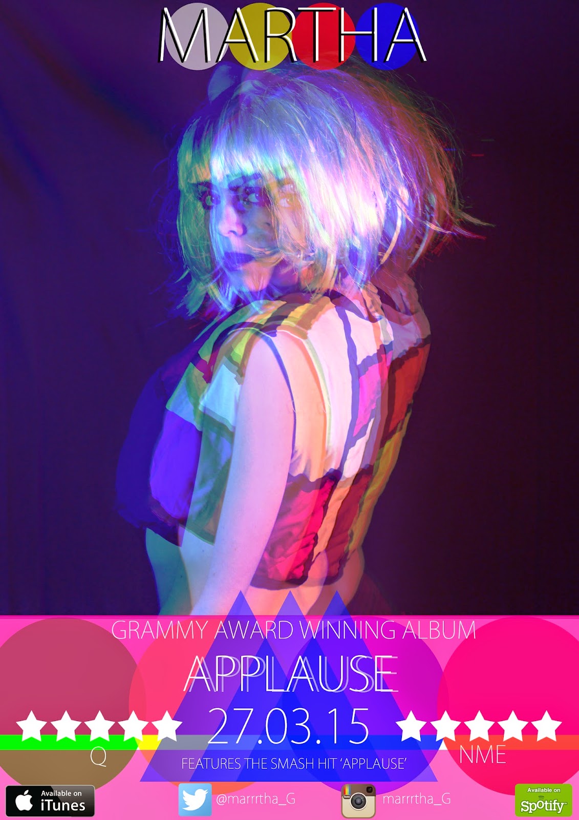
As you can see I have made some changes since the first draft, for example I have added the word album onto the 'GRAMMY AWARD WINNING'. This is just to show the audience that it is indeed an album and not promoting a single.
The next thing I have changes is the name of the artist at the top. This makes it more prominant to the audience and also shadowing it with a black shadow instead of a more transparent white one also makes it stand out.
Addding this at the top then made room for the album name to stand out more on it's own rather than the first one looking like the title 'MARTHA'S APPLAUSE' was the name of the album.
I have also added a plug line underneath the date, this again promots the album to the target audience as it is telling them that the album includes the 'SMASH HIT APPLAUSE'.
Creating the advertisment:
I started off by narrowing it down to just three images that I felt best supported the format of a music magazine advertisment. These are the three images I chose:


As you can see the image that I chose was the first one. I then changed the colour balance of the image to mainly red added it to an A4 sheet, resized it and this was the result:

I did the same for the blue and the green layers, this then gave me the layered 3d effect:

Now I was left with the space at the bottom and was wondering what I could do to fill the space, I didn't really want to copy off any existing advertisements, I wanted it to look fresh and new, something that did suit the style of the music video and the digipak. This was art.
I looked at my digipak for inspiration and was influenced by the use of the geometric shapes; so I filled the space with circles:

Again I changed the opacity of the shapes so they would overlay each other and create a sort of venn diagram effect. But this wasn't enough and to me it didn't stand out enough so again I put in some more geometric shapes, this time two rectangles and changed the opacity so you can see the circles. Again this was inspired by my digipak:

This is the advertisement with the conventional writing and reviews attached:


For my digipak I was influenced by an album cover by Pink Floyd, this was with the triangle and the beams of coloured light coming from the triangle. So in sticking with the style of my digipak I added a solid triangle and two translucent triangles of the same colour next to it, this was the result:

I again asked for feedback from the teacher and she suggested that I added something to the top. And I decided to put the Artists name at the top:


No comments:
Post a Comment